North Carolina’s skyline tells a bigger story than height alone. These towers reveal how ambition, regional identity, and engineering nerve can shape a city from the ground up.
As you move from Charlotte to Asheville, you’ll spot crowns, setbacks, glass prisms, and historic details that feel anything but ordinary. This lineup mixes giants and icons to show how the state’s skyscrapers turn structure into personality.
Bank of America Corporate Center (Charlotte)
When you look up at Bank of America Corporate Center, it feels less like a standard office tower and more like Charlotte wearing a ceremonial crown. Designed by Cesar Pelli and completed in 1992, the 871-foot giant still rules the Carolinas with a tapering profile that seems to pull the eye skyward.
I love how its pinnacle gives the skyline a confident finish instead of a flat stop.
The engineering is just as persuasive as the silhouette. Its mass narrows gracefully as it rises, balancing visual drama with structural logic, while the floodlit crown turns the top into a nighttime landmark you can identify from far across the city.
Even people who know nothing about architecture usually remember this one after a single glance.
Charlotte has flashier neighbors now, but this tower still carries a stately authority. It feels ambitious without shouting, polished without feeling cold, and iconic in the rare way only a skyline-defining building can be.
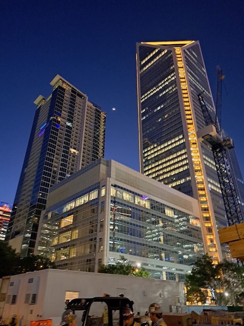
Duke Energy Plaza (Charlotte)
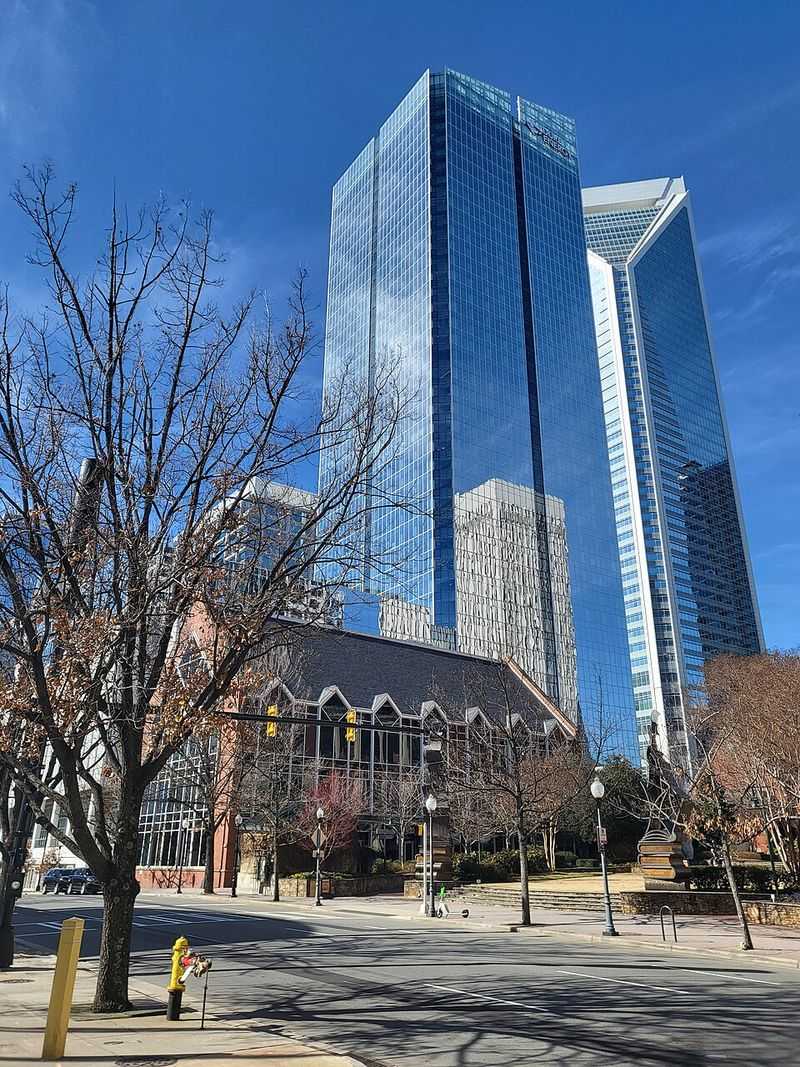
Image Credit: City Dweller 2.
Duke Energy Plaza looks like it was designed by someone who wanted a corporate tower to breathe. Rising 629 feet over Charlotte, this 2023 headquarters makes a strong first impression with giant carved sky-windows that interrupt the glass facade in a way that feels both futuristic and practical.
You get a building that reads as bold from a distance and surprisingly textured up close.
What really grabs me is the engineering story tucked inside the elegance. Its tube structure and cast-in-place concrete system help make it one of the tallest buildings in the world to use that approach, which gives the project an almost workshop-level fascination beneath its polished skin.
Add LEED Gold certification, and the tower becomes a statement about performance rather than pure spectacle.
It does not rely on an old-school crown or decorative top to feel memorable. Instead, the cutouts, proportions, and disciplined glazing make it feel like Charlotte’s skyline learned a new architectural language almost overnight.
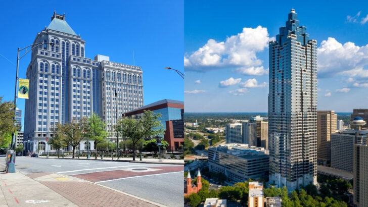
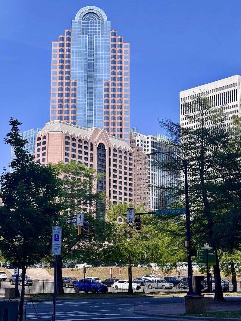
Truist Center (Charlotte)
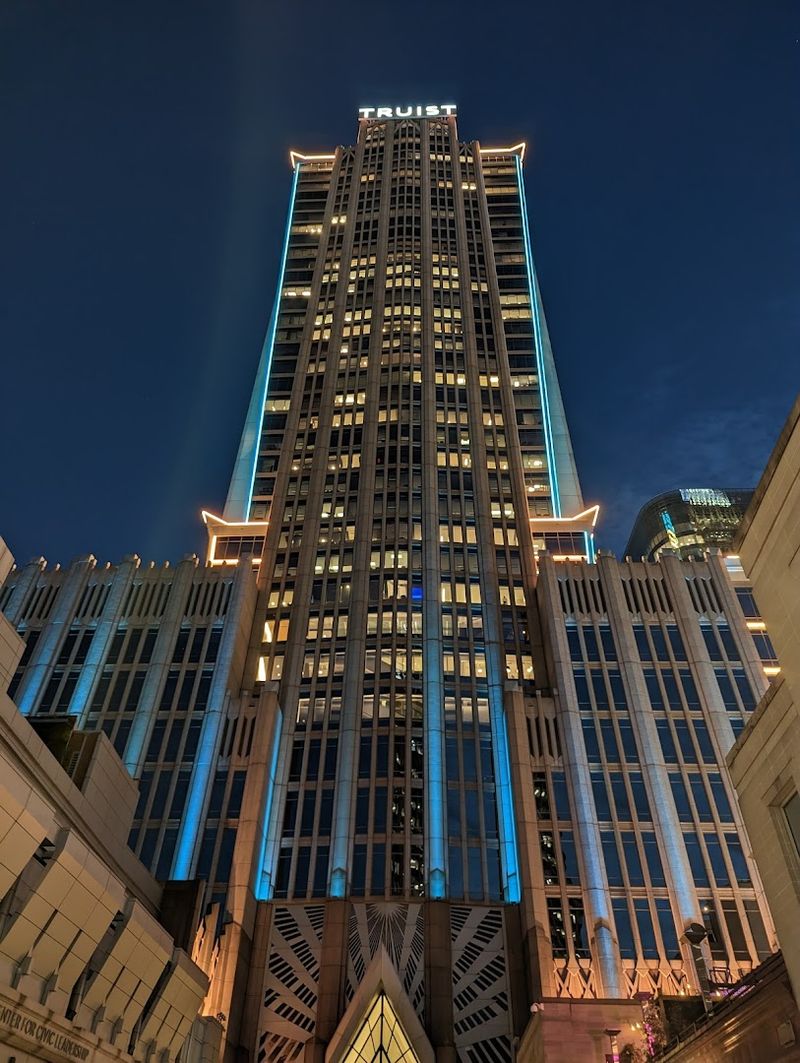
Truist Center is one of those buildings that feels like two time periods shaking hands in public. Formerly called the Hearst Tower, it pairs a 1929 Art Deco base with a 2002 glass-and-steel tower, creating a layered composition that could have turned awkward but instead feels surprisingly graceful.
You can read Charlotte’s past and present in one vertical glance.
The old base gives the building gravity, detail, and a sense of ceremony that many newer towers skip. Above it, the sleek tower rises with cooler confidence, letting modern materials do the talking while still respecting the historical platform beneath.
I think that contrast is what makes the building memorable rather than merely tall.
At 659 feet, it absolutely holds its own in the skyline, yet its greatest strength is not raw height. It is the visual negotiation between ornament and efficiency, nostalgia and momentum, which makes the whole structure feel like a carefully edited conversation across decades.
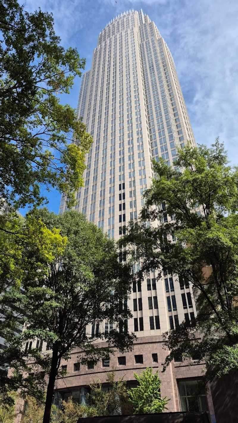
550 South Tryon (Charlotte)
550 South Tryon knows how to perform after dark. By day, it is a disciplined 786-foot office tower with clean lines, serious proportions, and the kind of glassy confidence you expect from a modern corporate landmark.
At night, though, the crown-like top comes alive with color-changing LEDs, and suddenly the whole building feels like part architecture, part stage lighting.
That theatrical streak sits on top of serious sustainability credentials. Known for years as the Duke Energy Center, it became a benchmark for green high-rise design as the first office tower to earn LEED CS v2.0 Platinum certification, proving environmental ambition could coexist with skyline drama.
You are not just seeing a pretty top here, but a building that helped redefine what performance could mean.
I like that its silhouette stays elegant without getting overly complicated. The structure feels streamlined, almost ceremonial, and its illuminated crown gives Charlotte a skyline moment that is both polished and unexpectedly playful every single evening.
One Wells Fargo Center (Charlotte)
One Wells Fargo Center has one of the friendliest nicknames in the state, and honestly, The Jukebox fits. Its rounded, dome-like top gives the 588-foot tower a profile that breaks from severe glass-box conventions, making it feel distinctly Charlotte and proudly postmodern.
When it opened in 1988, it did not just join the skyline, it changed the conversation about what a North Carolina high-rise could look like.
For a few years it was the tallest building in the state, but height alone is not the reason people remember it. The curved top adds softness to an otherwise disciplined vertical form, and that contrast gives the tower personality without tipping into gimmick.
I think its design still feels approachable in a skyline crowded with sharper, more aggressive silhouettes.
There is also a transitional quality to the building that I find fascinating. It captures a moment when Charlotte was becoming bolder, richer in architectural confidence, and ready to let a landmark be a little weird in the best possible way.
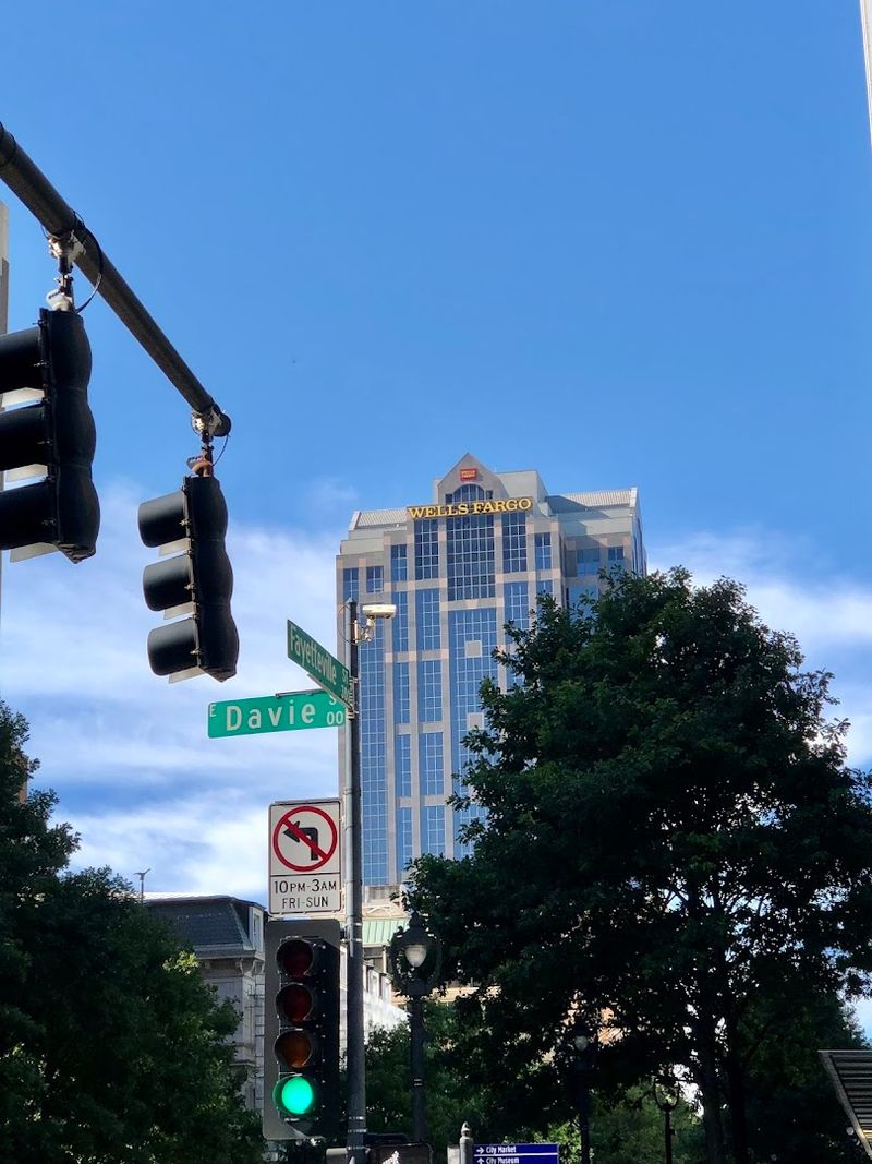
PNC Plaza (Raleigh)
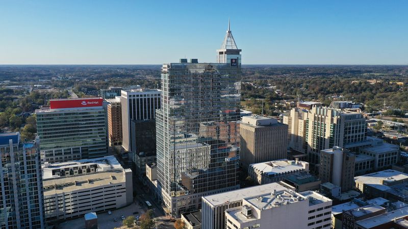
PNC Plaza feels like Raleigh deciding to stand on tiptoe and then never coming back down. As the city’s tallest building, this 538-foot mixed-use tower brings together offices, parking, retail, and residences in a way that turns complexity into a clean vertical statement.
Its multifaceted glass and shifting setbacks give it the restless energy of a city growing into a bigger version of itself.
The engineering story is especially satisfying here because different cast-in-place concrete framing systems support different uses within the same structure. That means the tower is not just tall, but carefully tuned to the demands of each section, which is the kind of quiet intelligence I always appreciate in skyscrapers.
You may first notice the shimmer, yet the real magic is how many jobs the building performs at once.
Architecturally, it does not lean on nostalgia or heavy ornament. Instead, it looks crisp, contemporary, and a little tech-forward, which makes sense in a capital city increasingly shaped by innovation, ambition, and a desire to look upward.
Two Hannover Square (Raleigh)
Two Hannover Square has the kind of silhouette that makes a skyline feel more rhythmic. Completed in 1991 and rising 431 feet, the tower uses angular postmodern geometry and a tiered crown to create a stepped profile that feels almost like a vertical staircase.
You can see why it once claimed the title of Raleigh’s tallest building, because it still carries itself like a centerpiece.
I enjoy how unapologetically of-its-era it looks without seeming dated. The angles give it tension, the top adds a formal finish, and the whole composition avoids disappearing into generic glassiness.
There is something refreshing about a tower that wants to be recognized by shape rather than by scale alone.
In a city where newer construction often leans sleek and smooth, Two Hannover Square adds a sharper accent. Its design makes Raleigh’s skyline less uniform, more conversational, and a bit more adventurous, proving that even a relatively restrained office tower can bring real personality to the urban backdrop.
Wells Fargo Capitol Center (Raleigh)
Wells Fargo Capitol Center does something subtle that I think deserves more credit. Instead of trying to overpower Raleigh’s civic core, this 400-foot tower uses symmetry and a reflective glass facade to converse with its surroundings, especially the formality associated with the nearby capitol district.
The result is a skyscraper that feels polished, measured, and very aware of where it stands.
Completed around 1990, it belongs to a moment when downtown Raleigh was asserting more vertical confidence without abandoning restraint. The facade catches light and neighboring buildings in a way that makes the tower seem slightly different from hour to hour, which keeps its presence lively even though the design itself is fairly disciplined.
You may not call it flamboyant, but you will probably remember its poise.
What I like most is that its architecture respects context while still signaling growth. It helps stitch together government gravity and business ambition, making it one of those skyline pieces that works best when you notice how calmly it holds everything around it.
Jackson Building (Asheville)
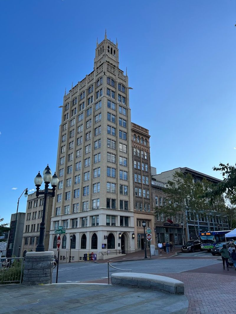
The Jackson Building feels like a dare that somehow became a landmark. Built in 1924 on an incredibly tight 27-by-60-foot lot, this 15-story Neo-Gothic tower rises from downtown Asheville with the improbable confidence of something that should not fit but absolutely does.
You can sense the ambition immediately, and that makes its status as North Carolina’s first skyscraper feel even more satisfying.
I love how vertical it looks, as if the building had no choice but to grow upward because there was nowhere else to go. Its narrow footprint, ornamental detailing, and little grotesques near the top give it the personality of a storybook tower squeezed into a city block.
That contrast between constrained site and expressive design is what makes it unforgettable.
Unlike bigger corporate giants, the Jackson Building wins by charm, audacity, and proportion. It reminds you that engineering can be theatrical on a smaller budget, and that a skyscraper does not need massive height to reshape how a city imagines itself.
Reynolds Building (Winston-Salem)
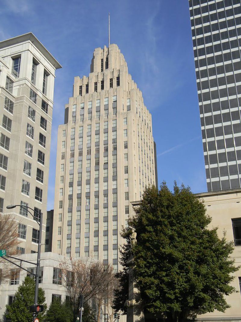
The Reynolds Building carries itself like a dignified elder who still has better style than everyone else in the room. Completed in 1929 and designed by Shreve & Lamb, the same architects later tied to the Empire State Building, this Winston-Salem landmark uses terraced setbacks and limestone detailing to create a classic Art Deco composition with real authority.
You do not just see height here, you see choreography.
Every setback feels intentional, guiding the eye upward in stages rather than one blunt thrust. That layered rise gives the tower grace while also reflecting the zoning logic and architectural fashion of its era, which is probably why it has long been linked to the design conversation that produced the Empire State Building.
I find that historical echo impossible to resist.
Even now, the building feels cinematic. Its materials, proportions, and decorative confidence make it stand apart from smoother modern towers, reminding you that engineering can be elegant, symbolic, and deeply persuasive when architecture knows how to turn mass into drama.
Lincoln Financial Building (Greensboro)
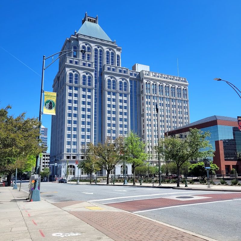
Lincoln Financial Building tells a more surprising story than its clean profile first suggests. As Greensboro’s tallest skyscraper, it marks a major chapter in the city’s commercial growth, yet its design was shaped by a desire to complement the older Jefferson Standard Building beside it rather than ignore it.
That choice gives the tower a contextual intelligence that feels rare and refreshingly unshowy.
Completed in 1990 as part of a larger historic complex, it avoids the anonymous look many late twentieth-century high-rises settled for. Instead, the building nods to Gothic Revival character in a way that ties new vertical ambition to an established architectural identity.
You get a tower that participates in history instead of trying to erase it.
I appreciate that balance because it gives Greensboro something more nuanced than a simple tallest-building trophy. The structure represents growth, yes, but also restraint and continuity, proving a skyline can evolve without severing its relationship to the cityscape that made such ambition meaningful in the first place.