Boston and its surrounding urban core know how to stage a conversation between centuries. Here, shimmering glass towers rise beside stone churches, brick row houses, and landmark streets that still carry the city’s oldest rhythms.
If you love architecture that feels bold without erasing history, this lineup is full of satisfying contrasts. These skyscrapers prove that modern design can stand tall while still being a good neighbor to the past.
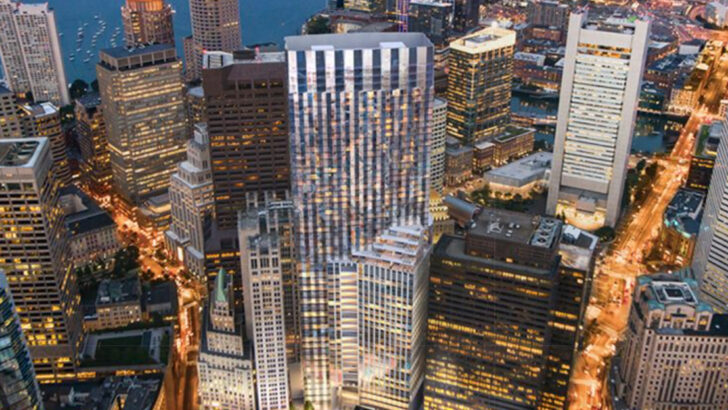
South Station Tower
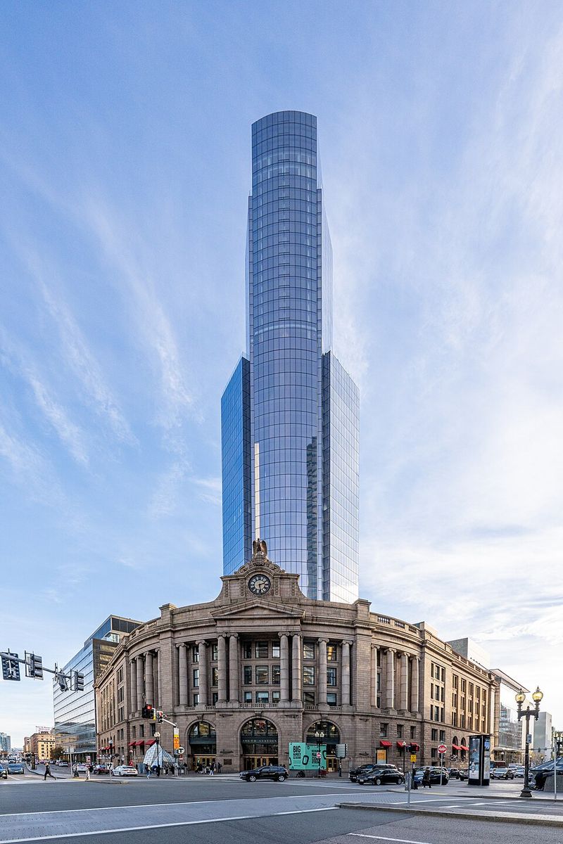
Image Credit: ajay_suresh
South Station Tower feels like a time-travel experiment that actually works. You see a sharp, faceted glass form climb 51 stories into the skyline, yet the 1899 Classical Revival station remains the emotional front door at street level.
That pairing gives downtown Boston a cinematic tension between motion, memory, and momentum.
What makes this project so satisfying is its restraint. Instead of swallowing the old station, the tower rises behind it, allowing the historic headhouse to keep its dignity while the new construction announces a very current ambition.
The massing feels contemporary, but it never acts like the past is disposable.
If you stand nearby, the contrast is especially vivid during rush hour. Commuters stream through a landmark train station while a polished new vertical city hovers above, almost like the future learned some manners.
It is a rare megaproject that feels both audacious and surprisingly respectful.
Winthrop Center
Winthrop Center has the confidence of a brand-new tower and the social grace of an older downtown building. Rising 691 feet in the Financial District, it introduces a sleek blue-glass profile while carefully folding restored historic facades into its lower levels.
You can feel the project trying to join the neighborhood instead of merely occupying it.
The tower’s vertical emphasis and detailed crown quietly nod to the Art Deco energy that shaped much of the area. That matters, because Boston’s older financial streets can punish a building that feels too generic or too aloof.
Here, the design looks modern, but not forgettable.
I also like that its sustainability story is not hidden behind marketing fluff. As an enormous Passive House office building, it suggests that high performance and urban sensitivity can belong in the same sentence.
When you walk by, the base speaks in masonry memory while the upper floors speak fluent twenty-first century ambition.
One International Place
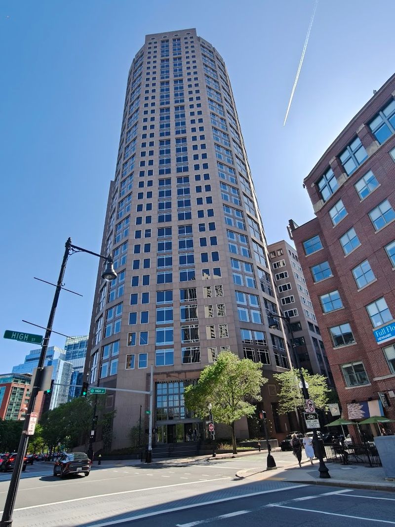
One International Place brings a polished, almost theatrical curve to some of Boston’s tightest and most historic downtown streets. Completed in 1987, the 46-floor tower uses a rounded, reflective facade that catches neighboring brick and stone buildings like moving scenery.
Instead of ignoring its context, it turns the surrounding city into part of its own surface.
That reflective quality makes the building feel less blunt than many office towers from the same era. Its postmodern character, with classical echoes tucked inside a corporate shell, helps it avoid the sterile anonymity that can make glass towers feel interchangeable.
You get monumentality, but also a bit of wit.
Walking around it, you notice how the curves soften the hard edges of the Financial District. The tower’s sheen changes with weather, traffic, and time of day, so the older streets never disappear from the experience.
It stands tall, yet it still seems willing to share the spotlight with the city that came first.
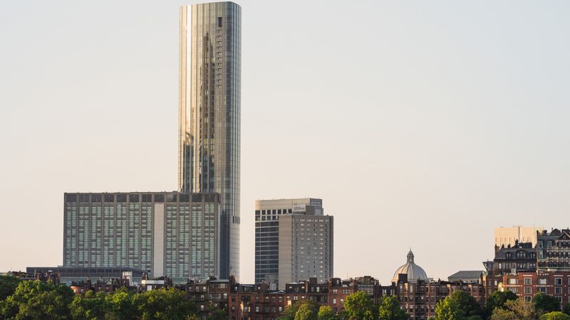
Millennium Tower
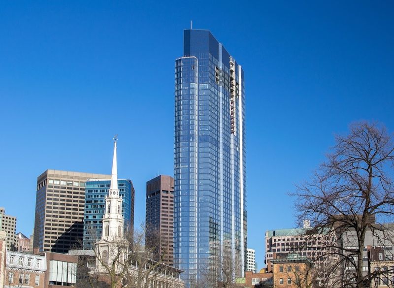
Millennium Tower might be Boston’s most photogenic lesson in architectural contrast. Its 60-story glass form rises beside Park Street Church, the 1809 landmark whose steeple once defined the city’s skyline, creating a juxtaposition that feels both dramatic and oddly graceful.
If you catch the right angle, the church seems to live inside the tower’s reflective skin.
The building’s faceted surfaces and shifting vertical planes keep it from looking like a plain slab. Light breaks across the glass in a way that softens the tower’s bulk, which matters when it stands next to one of Boston’s most recognizable historic silhouettes.
The result feels less like confrontation and more like a conversation across centuries.
What I find compelling is how accessible the contrast is. You do not need architectural training to understand why the pairing works, because your eye immediately reads old stone, sharp glass, and a skyline evolving in real time.
It is a postcard scene, but also a serious urban design achievement.
Federal Reserve Bank Building
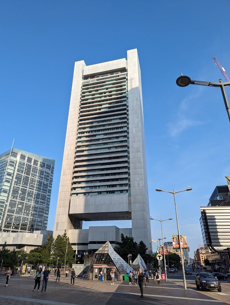
The Federal Reserve Bank Building does not charm you with nostalgia, but it earns respect through discipline. Stretching over a full city block and rising just above 600 feet, this mid-century modern landmark uses natural anodized aluminum, strong horizontal bands, and geometric fins to create a facade that feels rigorous rather than flashy.
In a dense historic center, that calm precision works surprisingly well.
Its famous spandrels do more than decorate the exterior. They respond to seasonal light, shading interiors during summer and welcoming more sun in winter, which gives the building an intelligence that still feels ahead of its time.
You can sense engineering and architecture cooperating instead of competing.
What keeps it connected to older Boston is not imitation but proportion and rhythm. The repetitive lines echo the ordered intensity of downtown streets, where masonry buildings, narrow corridors, and civic landmarks create a compact urban texture.
It stands apart stylistically, yet it still feels woven into the city’s deeply established grain.
One Dalton Street
One Dalton Street looks almost aerodynamic, as if Boston’s skyline suddenly learned how to slice through the wind. At 742 feet, this Four Seasons tower brings a sleek triangular geometry to the edge of Back Bay, where historic brownstones and brick streets still shape the neighborhood’s identity.
The contrast is obvious, but it never feels careless.
The tower’s softly curved sides help it avoid a harsh, overbearing presence. Instead of looming like a blunt object, it shimmers and tapers with a certain elegance, offering a contemporary counterweight to the richly textured masonry nearby.
You can appreciate the difference without feeling that one era is trying to defeat the other.
That balance matters in Back Bay, where visual harmony is taken seriously. From some viewpoints, the glass catches the sky while the older blocks hold onto warmth and detail below, creating a layered urban composition that feels almost choreographed.
It is luxury architecture, yes, but also a study in how height can coexist with historic intimacy.
One Congress
One Congress rises with the smooth confidence of a tower that understands its own stage presence. Completed in 2023, it introduces a curved, sail-like form to a historic downtown zone, using layered setbacks and a fluid glass exterior to keep the building elegant rather than overwhelming.
You notice the height, but you also notice how carefully it meets the street.
That relationship with pedestrians is where the design gets interesting. The tower draws from classical setback logic, which helps it acknowledge older streetscapes without turning into a retro costume piece.
It feels contemporary in every line, yet its shaping shows respect for the scale and rhythm of the district below.
From a distance, the facade can look like a theatrical curtain catching harbor light. Up close, the effect is more urban than poetic, because the building helps revive an area long associated with Boston’s layered civic and commercial history.
It is a sleek addition, but one that behaves like it actually belongs to the neighborhood.
111 Huntington Avenue
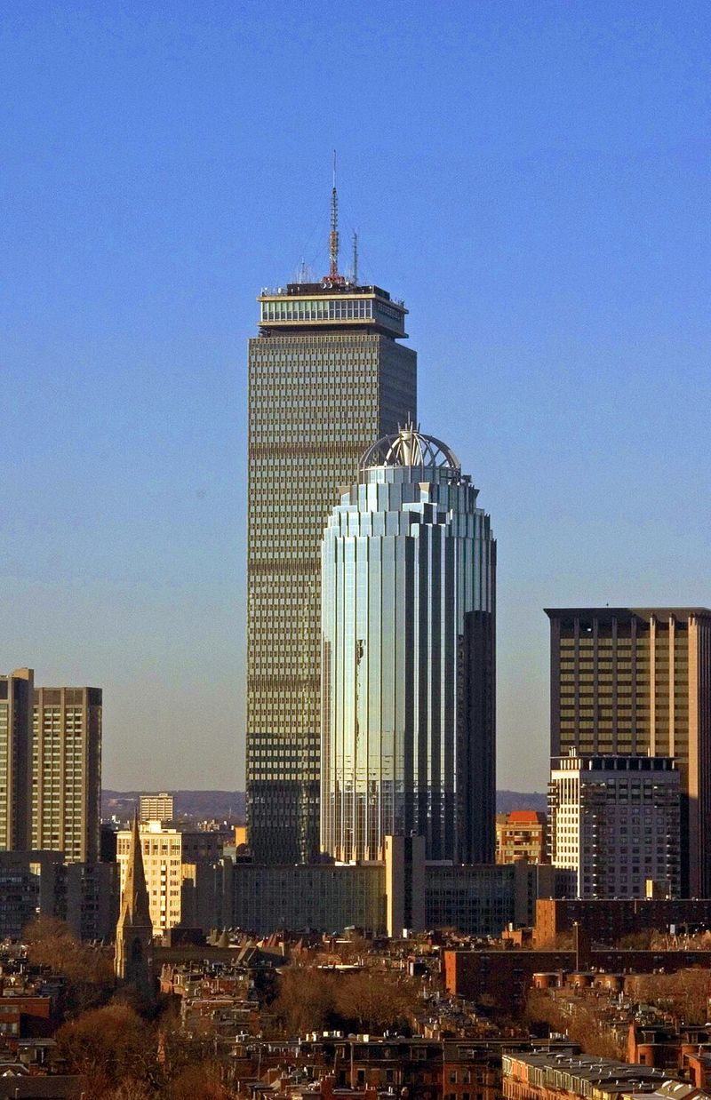
Image Credit: Fogster.
111 Huntington Avenue is one of those towers you can identify almost instantly from its crown alone. Rising more than 550 feet near Copley Square, the blue-glass building uses a top that resembles a lantern or a fragment of a classical column, giving the skyline a slightly playful silhouette without losing its formal presence.
That distinctive shape helps it converse with a district full of architectural personalities.
Its location near Trinity Church makes the comparison unavoidable, and that is part of the appeal. The tower does not imitate the historic landmark, but its postmodern gestures keep it from feeling indifferent to the older civic drama around it.
You get a modern anchor that still understands the importance of ceremony and profile.
I think the building works best when seen as part connector, part contrast piece. It ties contemporary development to one of Boston’s most beloved historic settings while maintaining its own identity.
In a city where skyline additions are judged harshly, that is a clever and surprisingly durable balancing act.
One Boston Place
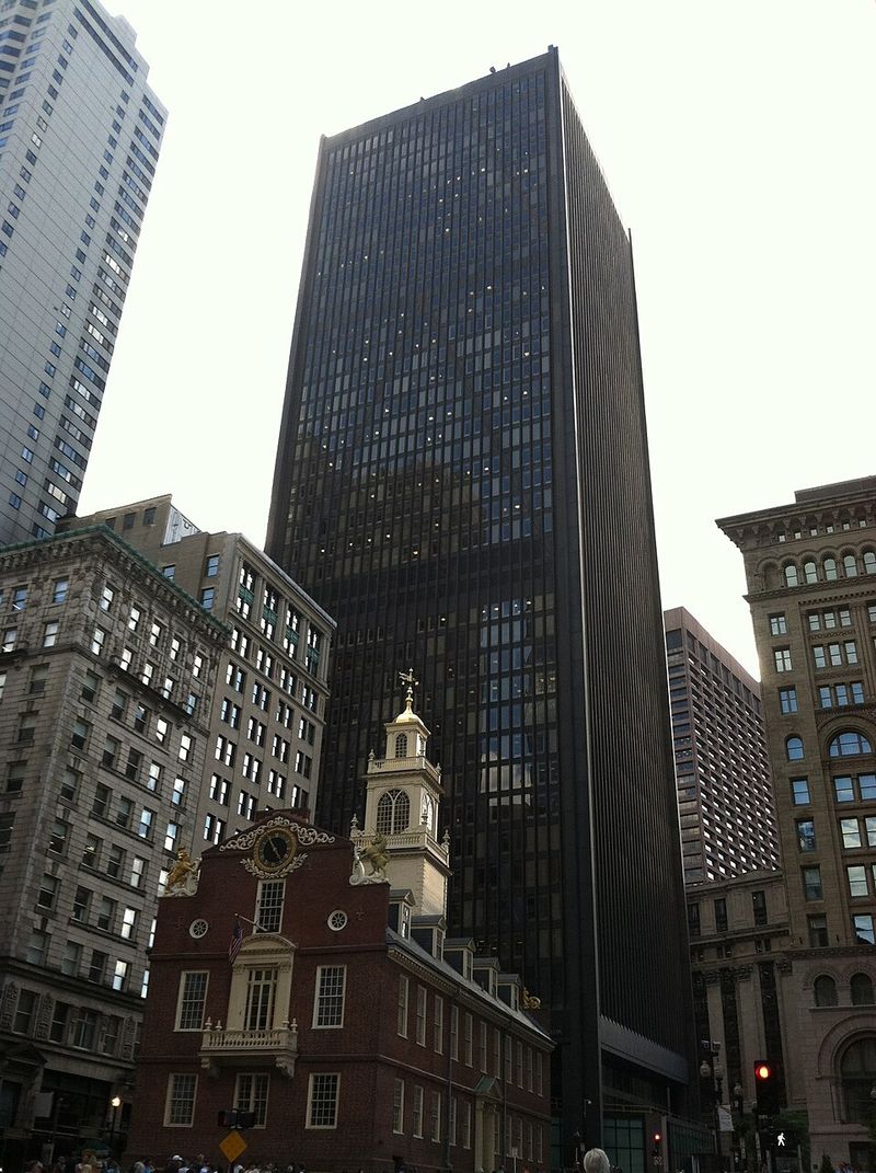
Image Credit: Raime.
One Boston Place makes no attempt to disguise its modernist convictions, and that honesty is part of its appeal. Standing just over 600 feet, the tower is known for its angled, cross-braced facade, a sharply geometric expression that contrasts with the brick and stone surroundings without dismissing them.
It feels like a deliberate exclamation point in a city full of commas.
What keeps it from clashing is its precision. The structural rhythm of the exterior brings order to the skyline, and that disciplined pattern somehow complements the masonry texture nearby even though the materials and era are completely different.
You are not looking at mimicry, but at a confident dialogue between systems and surfaces.
There is something refreshing about a building that chooses clarity over sentimentality. In downtown Boston, where history is visible on nearly every block, One Boston Place proves a tower can respect its context simply by being well composed, sharply detailed, and urban in scale.
Sometimes contrast, handled well, is its own form of harmony.
200 Clarendon
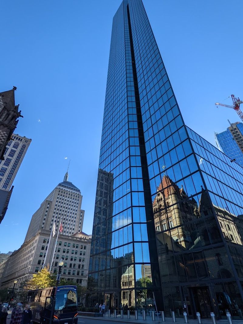
200 Clarendon is the kind of skyscraper that still stops you mid-block. Its blue glass skin feels almost weightless, yet the tower has a commanding calm that reshaped Boston the moment it arrived.
What makes it unforgettable, though, is the way Trinity Church appears in its mirrored surface, turning a modern landmark into a frame for a much older one.
Standing in Back Bay, you get that rare sense of architectural conversation instead of conflict. The sleek geometry never erases Copley Square’s history – it heightens it.
Few towers prove more elegantly that modern design can honor its surroundings by reflecting them, literally and emotionally.
Exchange Place
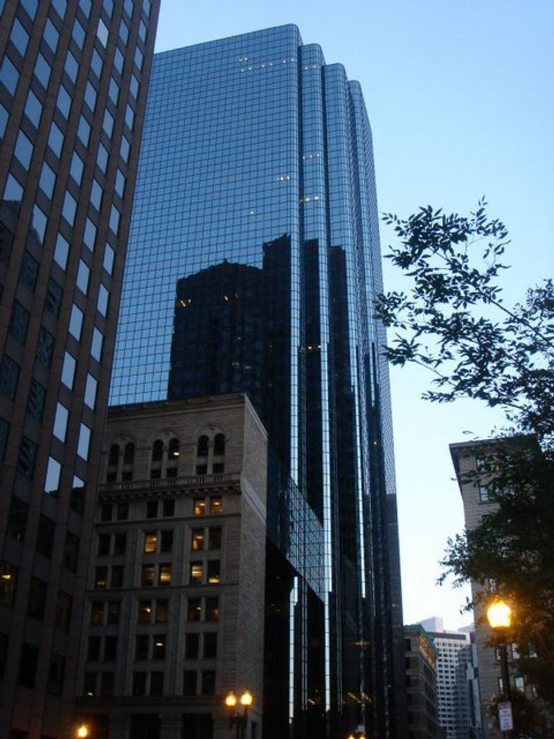
Image Credit: Arjunkach.
Exchange Place feels quietly confident, which is part of its appeal. You get a sleek granite-and-glass tower, but it never bulldozes the personality of the Financial District around it.
Instead, it slips into a streetscape where Boston’s older commercial buildings still set the mood.
That balance makes the whole block more interesting to look at. The tower’s reflective surfaces pick up changing light, while the surrounding masonry keeps everything grounded in local history.
Walking here, you notice how modern scale and old street patterns can share the same conversation.
It is polished, urban, and unmistakably Boston.